We’re going to explain how every single key in this template works.
For the initial configuration of the behavioural message, please refer to the dedicated article how to configure a behavioural message.

OPTIONS->OTHER
Show on load(YES) _ Show after scroll(NO): If set to YES the image will load instantly when the page loads and, if there is a timing in the “Show only after x seconds” field, it will wait for that time after the page loads. If set to NO, the popup will load when the user starts scrolling the page after X time, if set to “Show only after x seconds”.
Downtime since closing: Indicates how long it takes for the popup to be shown again. If the cache is cleared, the message will be shown again on the next load/scroll.
Show only after x seconds: Number of seconds that the pop-up is delayed when loading or scrolling.
Initial animation (fadein/fadeout): The type of animation when the popup appears.
Warning duration (in seconds): time during which the message will be visible, when the time expires, if set, the message will close automatically.
LAYOUT-> Message Text
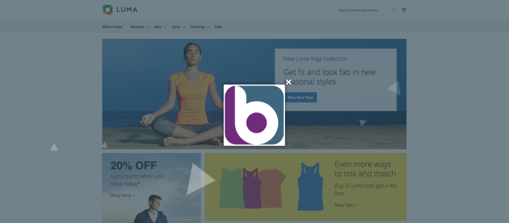
Image: Here you can upload the image that will appear inside the popup, we recommend a resolution at least equal to the pixels set in the next step
Side Image Width (in px): The width in pixels of the image
Image Link: link on image
Click on the image: If set to YES the popup is closed once you click on the image, NO otherwise. If there is a link on the image, it will open in a new window and the image will close, starting the countdown for the time set in the Idle Time on Close field.
LAYOUT->Other
We can insert a CSS shape, we refer you to the site, to be able to generate your custom shapes.
We can decide whether or not to show the outer overlay.
Animated outer overlay: We can decide whether to display animated shapes.
Outer Overlay Opacity (in %) accepts values from 1 to 100 and sets the opacity of the outer overlay.
Live Background Shape Opacity (in %) sets the opacity of animated outer shapes.
Closing box icon : we can select the icon to be used for the close button of the message.
zindex We set the z-index to place the message on top of the site elements.
Additional CSS code: In this field, you can add valid CSS for customizing the message stylesheet
LAYOUT->Location & Dimensions
Distance of the box from the sides (in px): set a minimum distance from the edges that the message must respect.
Box position: a select appears where we can set the position of our message.
Show drop shadow: we can turn the drop shadow on or off.
Outer Overlay Color: Sets the background color of the outer overlay.
Live Background Shape Color: Sets the color of animated outer shapes.
Show drop shadow: we can turn the drop shadow on or off.
Close Icon Color to set the close icon color of the message.
Outer border color: Outer border color of the message.
Border width (in px): The outer border thickness of the message.
Background color to set the background color of the entire message.
Right position closing icon (in px) | Top position closing icon (in px) we can place the closing icon, we can also enter negative values.
Content padding (in px): The distance of the content from the edges of the message.
Rounded corners (in px) to set the rounded corners of the message.
Thanks for contributing!
