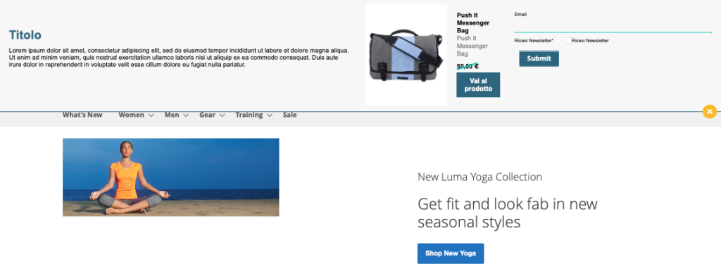
This template is designed to show the user, when the page loads, a popup that can appear from above or below. This popup can optionally contain an image, form, text, additional button, or countdown timer.


OPTIONS>Other
Exit animation: Animation time in milliseconds to close pop-up
Animation speed (in ms): Time in milliseconds of the opening animation
Show Form: Show or hide the selected form in the behavioural message configuration step
Cookie duration when closed: how long it will take for the message to be shown to the user again (days, hours and minutes)
Additional Button Container Percentage Width: The percentage occupied by the additional button within the additional text block
Form Width Percentage: The percentage of the space occupied by the form within the container
Container Percentage Width*: Percentage width of the parent container
*only in behavioural messages with rec
LAYOUT>Other
Image size/Image width in pixels*: width of the image in pixels, the Show side image field must be activated to display it
Drop Shadow: Toggle the background shadow at the pushbar container
Rounded corners: radius of rounding of the corners of the pushbar container, value 0 indicates the non-rounded corner
Edge Width (in px): thickness of the rim of the container
Input Field Border Color: The color of the form’s input fields, if present
Background Image Opacity (0.1 to 1): Container Background Transparency, 0 – Invisible, 1 – Fully Visible
Background color: as the background of the container it is possible to set a color, selectable in the window or by entering the hexadecimal code directly, to have the transparency add two additional digits that indicate the percentage of opacity of the color
Show side image: You can turn on or off the display of an image inside the container
Border Color: The color of the container border, visible if the Border Thickness field is set to a value greater than 0
Side image link: You can set a link on the image inside the container
Side image: from here you can select or upload an image to the Blendee media gallery, which will be placed to the left of the container by default. You can change the position from the “Position and size” menu.
Background image: from here you can select or upload an image to the Blendee media gallery, that image will be shown as the background of the container
Additional CSS code: we can insert custom CSS code
WARNING: Enter valid CSS code.
Padding pushbar: padding of the pushbar
Padding form: padding of the form, if enabled
Additional Button Link: Additional Button URL
LAYOUT>Message Text
Link color: The color of the links within the text
Form Placeholder Color: The color of the placeholders within the form fields
Content Color: The color of the content of the text message
Hover Link Color: The color of hover links
Title Color: Selecting the color of the text message title
Title Font: The size of the font used in the title
Content: Text editor for inserting and formatting content
Content font size: The size of the font used in the paragraph of the text content
Content Font: font style of text content (e.g.: Arial, Helvetica, sans-serif)
LAYOUT>Location & Size
Left Image: Positioning of the image inside the container, yes – left image, no – right image
Fixed Position: unlocking of the possibility to place the popup with fixed or relative positioning, only in the template without recommendation
Pushbar at the top: Place the popup at the top
Position of the additional button ( YES = Right / No = Left): position of the additional button on the right or left
Show additional button in text: Adds a button with a link to the text container
LAYOUT>Content recommendation*
Rec button text: Item product link label
Original Rec Price Color: Font color of the item’s starting price
Product Description Color rec: Font color of the product description
Rec button text color: font color of the button label with the link to the article
Rec button background color: The background color of the button that links to the article
Rec Product Title Font: Size of the rec title
Rec Product Title Color: Product Title Color
Show rec description: enables/disables the display of the rec description
Show rec title: enables/disables the display of the rec title
Show rec product image: enables/disables the display of the product image
Rec margin in px: margin of the article card in px
Padding rec image in px: padding of the card image
Rec Price Font Size: Font size of the product’s original price
Rec Price Cut Bar Color: Price Cut Bar Color
Discount price color rec: color of the final price net of the discount
*only in behavioural messages with rec
BUTTONS > Button
Button Border: Activating /deactivating the button border
Button Background Color: The background color of the buttons
Button border size (in px): Thickness of the button border in pixels
Close button position YES = Right / No = Left: Placement of the popup close button to the right or left
Button hover background color: Hover button background color
Button hover text color: The color of the hover button text
Button Border Color: Color of the “close” button border
Hover Close Button Color: Color of the “close” button on hover
Close button color: color of the “close” button
Close button icon color: color of the “x” of the “close” button
Button Text Color: The color of the text inside the button
COUNTDOWN > More
Second Expiration _ Countdown [ES: 01]: Setting the seconds of the countdown expiration date (accepted values: 0 -59)
Expiration Minute _ Countdown [ES:30]: Setting the minutes of the countdown expiration date (accepted values: 0 -59)
Expiration time _ Countdown [ES: 16]: setting the time of the countdown expiration date (accepted values: 0 -23)
Expiry year _ Countdown [ES: 2024]: setting the year of the countdown expiry date (accepted values: current or future year)
Expiration day _ Countdown [ES: 2]: setting the day of the countdown expiration date (accepted values: 1 -31)
Expiration Month _ Countdown [ES: 1 ]: Setting the month of the countdown expiration date (accepted values: 1-12)
Show Countdown: Show or hide the countdown
Countdown padding box: padding of the countdown container
Countdown border radius box (in px): radius of the corners of the countdown container
Background Color Countdown: Window for selecting the background color of the countdown. To have transparency, add two numbers after the hexadecimal code to indicate the percentage of opacity (e.g.: #FF000050: red color with 50% opacity)
Countdown font color: The color of the countdown text
Timeout end text: text that will appear at the end of the countdown in its place
Thanks for contributing!


