We’re going to explain how every single key in this template works.
For the initial configuration of the behavioural message, please refer to the dedicated article how to configure a behavioural message.

LAYOUT->MORE
Hide for mobile: Hides the animation if you’re viewing the message from a mobile device
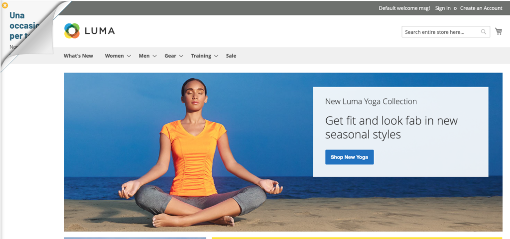
Activate the page peel: with page peel deactivated the graphic that will be displayed is the one visible in the first image above, with page peel activated the graphic is as shown in the second image.
Place at the top: The message will be shown in one of the top corners
Fixed size (in px _ if dimension locked): Height and width of the corner. Clutter once you open the behavioral message.
You want to lock in the size: Fix the maximum size of the corner footprint with the page peel open and visible
Position on the left: The message will be shown in one of the left corners
Additional CSS code: In this field, you can add valid CSS for customizing the message stylesheet
LAYOUT->LOCATION AND DIMENSIONS
Button rollover border color: The color of the button border on hover, if any
Button Border Color: The color of the button border, if any
Button border size (in px): Thickness of the button border in px, 0 if not desired
Button Rollover Background Color: Hover button background color
Button rollover text color: The color of the text inside the button on hover.
Button Background Color: The color of the button background
Button Text Color: The color of the button text
Starting width/height (in px): dimensions of the overall dimensions of the page peel at the start, with the page peel closed. This footprint is the square on which the page peel is built, so width and height in pixels are equal, the value set will correspond for both measurements
Rollover width/height (in px): Dimensions of the footprint of the page peel at the start, on hover, then on opening. This footprint is the square on which the page peel is built, so width and height in pixels are equal, the value set will correspond for both measurements
Background color: Page peel background color
Outer Edge Color: Page Peel Border Color
Outer edge size (in px): Dimensions in pixels of the edge of the page peel, 0 if not desired
Show outer border: deactivate/activate the outer border with one click, equivalent to setting the size of the outer border to 0
LAYOUT->MESSAGE TEXT
Uppercase button text: Transforming the text inside the button into all-caps text
Uppercase Title Text: Transform the message entered in the Title Text field to all caps
Text Color: Selecting the font color used for text entered in the Text field
Title size (in px): The size of the font used in the title
Title Color: The font size of the message entered in the Title Text field
Content Icon Size (in px): The size in pixels of the icon that can be placed before the Title Text
Content Icon Color: The color of the icon selected in the previous step
Title Text: Sentence that will be shown as a title within the page peel, type h3. It is possible to set color, size, upper/lower case by configuring the fields seen above
Text: Text contained within the page peel, paragraph type. It is possible to set color, size, upper/lower case by configuring the fields seen above
Content Icon (write hide to hide): icon shown before the Title Text. To hide the icon, write hide inside the field
Text size (in px): The size of the font used for the button text
LAYOUT-> BUTTON
Target button: Choose whether you want the link to open in a new tab or in the same window
Button Link: Enter the url to which the button should link
Button text size (in px): The font size used for the button text
Close Icon Rollover Color: Hover color of the close icon background
Close Icon Color: Background color of the close icon
Close button icon: Choose the icon used in the button that closes the page peel
Button Rounded Corners (in px): Rounding radius of button corners
Button Text: CTA button text
Thanks for contributing!