We’re going to explain how every single key in this template works.
For the initial configuration of the behavioural message, please refer to the dedicated article how to configure a behavioural message.


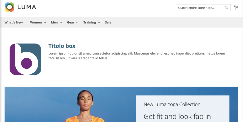
The Next Box Message template is used to insert an element on your page that can contain one or more of these elements:
- HTML text
- Side image to text
- form
- Product Recommendations
It will be possible to deactivate and activate the various features during customization.
We remind you that in order to show product or content recommendations within a behavioral message, it is necessary in step 1, during the creation phase, to select the item we are interested in: products, content, products and contents, forms and the type of algorithm to be used in case the recommendations are present

Attention: This message, not being an Overlay , must be inserted within the structure of the page before/after or in place of existing elements. At the beginning of the configuration of the behavioural message, you must define the XPATH in which it will be placed. You can find a detailed guide on how to do this at this link. Until XPATH is selected, you will not be able to preview it. If the defined XPATH is not present on the page, the message will not be displayed.
Layout
Layout -> Message Text
Uppercase Titles: Allows us to turn the title into all-caps text
Title Color | Title size (in px): We can set the color and size for the titles.
Link color : We can set a color for links within the text content.
Internal HTML content: HTML input box from which we can insert and format the text to be displayed in the message.
Side image we can insert a side image through the Blendee media gallery.
Side image on the left : if set to yes the image will be inserted on the left, otherwise it will go to the right.
Display side image we can decide whether to display the side image or not.
Maximum Side Image Width (in px): We can set the maximum width of the side image.
Side image target link we set where the link on the image is opened: whether in a new tab or in the current window.
Side image link: enter the URL to which the image should link.
Hide HTML content: toggles the display of the text of the message contained in the HTML box
Hide side image: show/hide the side image of the message
Layout -> Button
Uppercase button text: You can convert text to all-caps font
Button rollover background color: The background color of the button on hover.
Rounded corners, buttons (in px), rounding radius of button edges.
Text Color Buttons: Text Color Buttons.
Button Background: The background color of the buttons.
Button text size (in px)
Rollover Button Border Color sets the color of the borders on hover.
Button Border Size | Button border color: Button border color and thickness buttons.
Layout -> Location and Size
Box message top margin (in px): distance in pixels from the top element
Box message bottom margin (in px): distance in pixels from the bottom element
Padding box message (in px): Inner distance in pixels from the edge of the element
Box message outer border size (in px): thickness of the outer border of the box containing the message in pixels
Outer border color box message: color of the outer border of the box containing the message
Rounded corners box message (in px): rounding radius in pixels of the edge of the box
Box message background: The background color of the box containing the message
Internal text size (in px): The size of the font used for the text within the message
Inner Text Color: The color of the text within the message
Layout -> More
Additional CSS code: in this box it is possible to enter the valid CSS code that allows us to customize the style sheet of the message
Form
Form -> Position and Dimensions
Radio/Checkbox Color: Field Selection Mark Color
Form Label Color: The color of the form’s label
Label form size (in px): The size of the font used in the form’s labels
Form Input Border Color: The color of the border used to highlight the form’s input box
Form Input Background: The background color used for the form’s input fields
Rounded corners of the form (in px): The rounding radius of the edges of the form.
Padding form (in px _ if form background is enabled): Inner distance between the edge of the form and its internal elements
Enable form background: Activates/disables the presence of a form background color
Form Background Color: The color used for the background of the form if activated in the previous step
Hide Form: Show/Hide Form
Minimum form width (in px): The minimum size in pixels that the form must have


Recommendation (Keys present only in the “Next Box Message with Recommendations” template)
Layout -> Recommendation Content
REC Product Name Color: The color in which the item name will be displayed
REC Price Color: The color in which the item’s price will be displayed
REC Button Text: CTA on the button on each product sheet e.g.: “Buy now”
REC Title Text: Header of the box containing product recommendations e.g.: “You may be interested”
REC image height (in px): the size in pixels relative to the height that the product image should have
REC name size (in px): The font size used for the product name
REC price size (in px): Font size used for the product price
REC before HTML content: shows the recommendation before/after the text entered in the HTML box
Border color between REC and content: The color of the dividing line between HTML text and product recommendations
Border size between REC and content: Thickness of the dividing line between HTML text and product recommendations
Hide REC Title: Show/hide the title of the recommendations section
Hide REC Name: Show/hide the product name in the recommendation card
Hide img REC: Show/hide the product image in the recommendation card
Hide REC Pricing: Show/hide the product name in the recommendation card
Hide REC Button: Show/hide the button with the link to the product in the recommendation card
Hide REC: Show/hide the block containing product recommendations.
Thanks for contributing!
