We’re going to explain how every single key in this template works.
For the Initial configuration of the Recommendations, please refer to the dedicated article how to create a recommendation.
The only difference between the “Vertical” and the “Horizontal” is the direction of scrolling of the RECs, otherwise at the level of keys and settings they are the same.

CAROUSEL > More
Left Arrow Carousel | Right arrow carousel we can select the icons for the carousel arrows.
Carousel _ padding between elements (in px) is the distance between the elements of the carousel, the higher the value the greater the spacing.
Carousel _ animation timeout is the interval between one automatic animation and another.
Carousel _ autoplay pause rollover we can activate the pause of the carousel when the cursor is over it.
Carousel _ autoplay toggles the automatic carousel animation on and off.
Carousel _ animation speed (in milliseconds) the higher the value, the slower the animation will be
Carousel controls grouped to the left (only if centered set to off) puts all controls grouped to the left.
Central carousel controls puts buttons and bullets all central.
Hide Carousel Controls hides the left and right arrows.
Hide carousel nav hides pagination bullets.
Activate drag mouse carousel We can activate or deactivate the drag of the carousel with the mouse.
Carousel Number of Desktop Visible Items | Carousel Number of Tablet Visible Items | Carousel number of mobile visible items for each device, we can decide how many items will be visible on each page of the carousel.
CAROUSEL > Location & Size
Carousel Border Thickness | Carousel Border Color | Carousel Wallpaper | Carousel Rounded Corners | Margin before and after the carousel (in px) | Maximum carousel width (in px) Carousel container customizations.
Color Bullet Border Carousel Rollover | Bullet carousel rollover background color | Color Bullet Carousel Border | Active Bullet Carousel Border Color | Bullet carousel edge thickness (in px) | Active Carousel Bullet Background Color | Bullet carousel size (in px) | Bullet carousel background color Customization of bullets (dots) for the pagination of the carousel.

Background Color Rollover Carousel Controls | Rollover Carousel Controls Icon Color | Rollover Carousel Controls Border Color | Horizontal padding of carousel controls (in px) | Carousel Controls Border Color | Carousel Controls Icon Size (in px) | Vertical padding of carousel controls (in px) | Carousel Control Border Thickness (in px) | Carousel Controls Icon Color | Rounded corners of carousel controls (in px) | Carousel Controls Background Color Button customizations for scrolling through carousel elements.
Carousel Controls on the Sides inserts arrows on either side of the carousel, one on the left and one on the right, centered vertically to the content.

LAYOUT > Recommendation content
Order Product Name | Brand Order | Image Order | Order short description | We can decide the order of each item, the higher the value and the sooner it will be entered.
Original price above the sale price : We set whether the sale price should be next to the price or above.
Show currency symbol before price if set to “yes” shows the currency before the price, otherwise it inserts it after.
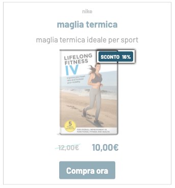
Hide Additional Text Discount Label | Discount Label on the Left | Discount Label at the top | Rounded Corners Discount Label | Discount label text size (in px) | Discount Color Label | Vertical Distance Discount Label (in px) | Horizontal Distance Discount Label (in px) | Discount label internal padding (in px) | Additional Text Discount Label | Discount label background : these parameters are used to customize the discount label.
Brand name size (in px) | Brand Name Color | Color Reduced Price | Original price | Product description color | Product Name Color | Product description size (in px) | Product Name Size (in px) | Maximum carousel image height (in px) | Bar size original price (in px) | Bar Color Original Price | Size sale price (in px) | Original price size (in px) we set the colors and size of the text content of the cards.
Original Price Slanted Bar : If set to “Yes”, the bar on the sale price will be oblique, otherwise it will be straight.
Card Rollover Button Color | Card Rollover Button Border | Card Rollover Button Background |Card Roll Border Color | Card Rollover Background Color | Card Border Color | Card Background Color | Vertical card padding (in px) | Horizontal card padding (in px) | Right Side Card Border Size (in px) | Left side card border size (in px) | Card bottom edge size (in px) | Top card edge size (in px) customizations of individual cards.
Card Image Animation toggles the image zoom on or off when the mouse hovers over the card.
Hide Image Discount Label | Hide REC Button | Hide REC Pricing | Hide REC Image | Hide REC Description | Hide REC Name | Hide REC brand: we can hide the elements of the card that we want.
LAYOUT > Message Text
Additional Content Edge Thickness | Additional Content Border Color | Add-on Content Background | Rounded Corners Additional Content | Margin before and after the add-on content (in px): box customizations for the add-on.
Hide additional content : If set to “yes”, all text and image content before the carousel will be hidden.
Maximum add-on width (in px): We can set a maximum width for the add-on box.
HTML additional content : we insert and customize the additional text content to be inserted.
Side image on the left : if set to “yes” the image will be placed on the left, otherwise it will be placed on the right.
Side Image | Maximum side image width (in px) We select the image from the media gallery and set the size.
Additional Content Link Color | Additional Content Text Color | Add-on Content Title Color | Additional Content Title Size (in px) | Text size: Additional content (in px): Size and colors for additional text.
Hide side image : if set to “yes” the image will not be visible.
LAYOUT > More
Additional CSS code : we can add CSS code to our carousel.

BUTTONS > Button
Button Rounded Corners (in px) We set the rounded corners of the buttons.
Full-width button: The card button will take the full width available.
Rollover Button Background Color | Rollover Button Text Color | Rollover Button Border Color | Button Border Color | Button Text Color | Button Background Color : We configure the color of the buttons for the rollover state as well.
Button text size (in px) | Padding above/below button (in px) | Button side padding (in px) | Button border size (in px): We set button and text sizes.
Button Text : We enter the text to be displayed inside the button.
Thanks for contributing!