We’re going to explain how every single key in this template works.
For the initial configuration of the behavioural message, please refer to the dedicated article how to configure a behavioural message.
The “Next Push Notification Enabler” template will allow you to show users a message through which they can subscribe to push notifications. In order for the template to work, it is necessary to have the Push Notification module active in Blendee and to have correctly configured the service-worker on your site. Please refer to technical support for information on how to proceed to activate this feature.
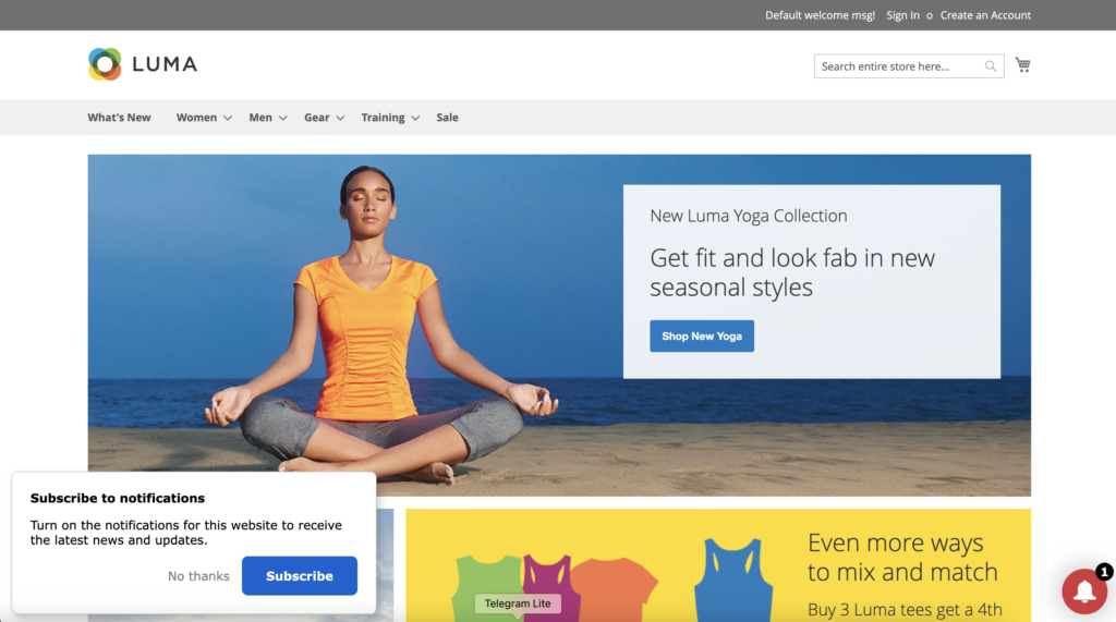
On the bottom left the Popup for subscribing to the push, on the right the Bell button
Popups
Popup -> More
Display frequency: days after which the message should be displayed again
Icon (192 x 192 px): Insert a custom icon within your 192×192 pixel message (e.g. your brand logo)
Position (left | right | top): where we want the message to be displayed. Left, right, or top center.
Margins (px): pixels offset from the edge of the page
Popup -> Message Text
Title: Title that will be inserted in the message box
Text: Text inserted below the title in the message box
Permission Denied Alert Title: Title in case push permission is denied
Permission denied alert text: Text in case push permission is denied and how the user can change their browser’s permissions by allowing notifications
Font Family: font used for the text inside the box
Button
Button -> Buttons
Confirm button text: text inside the button that is used to accept push notifications in the notification box
Hide button text: text inside the button that is used to decline the invitation to subscribe to push notifications in the notification box
Confirm Button Color: color of the confirmation button for subscribing to push, inside the box
Bell Button
Bell Button -> Button
Show Bell Button: show/hide push notification subscription bell
Bell button size (px): Pixel size of the button containing the bell icon
Bell Button Background Color: Background color of the Bell button
Position (left | right): Position of the button, whether left or right, at the bottom
Bell Button Animation: Activates/deactivates button animation
Thanks for contributing!