Blendee’s Audience Analytics section gives you a detailed overview of your audience over the past 30 days. It allows you to analyze both the audience tracked on a single portal and the audience tracked across your entire network. Thanks to the Audience Dashboard you will be able to get relevant information such as the device mainly used, what are the top 5 domains and tags, the number of unique users who visit your digital properties and advertising campaigns and the number of actions performed by users.
How to get an overview of your audience in the last 30 days
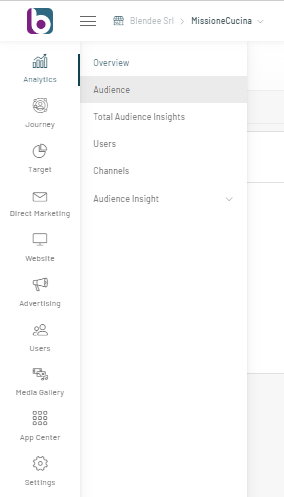
To access the Dashboard, click on “Analytics” and then on “Audience” in the main menu of Blendee.
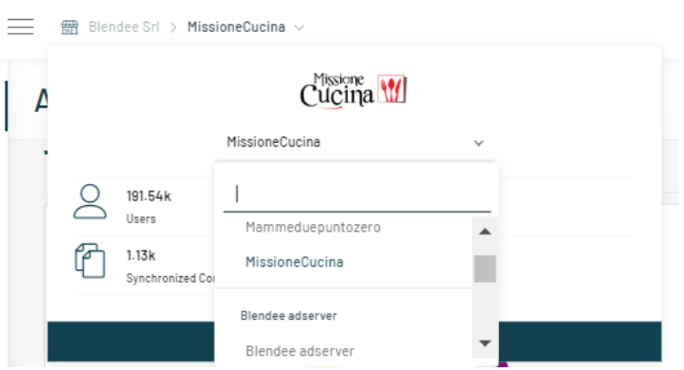
The entire Audience Dashboard can be filtered by portal and by network. By default, Blendee shows the data of the Audience tracked on a given portal. To change portals, simply click on the drop-down menu at the top and select the desired portal.
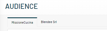
By clicking on the second tab, you can view the data of the total Audience tracked on all your digital properties.
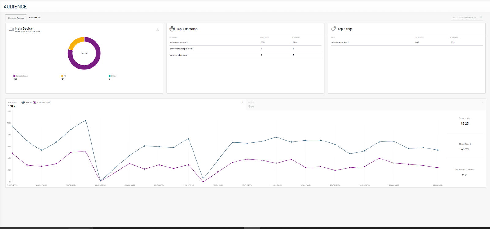
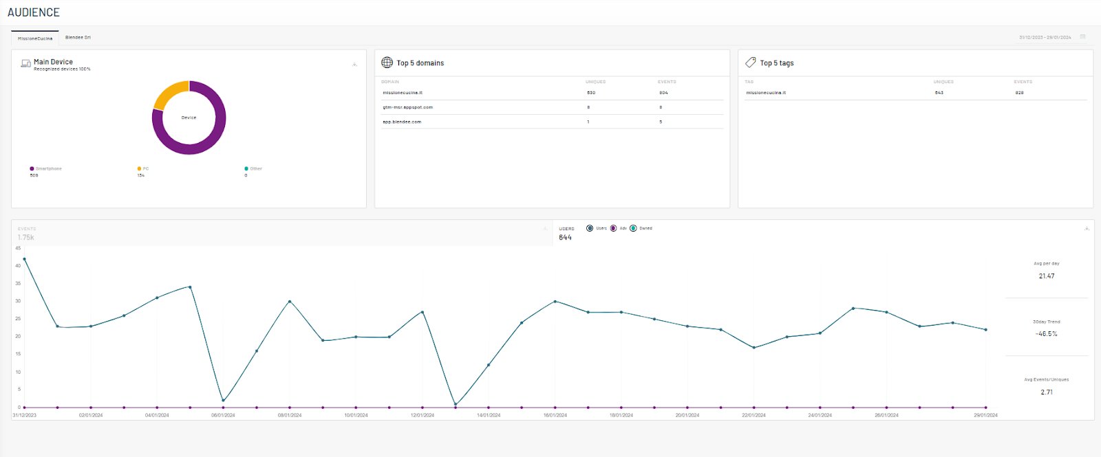
Once you have accessed the section, the Dashboard will show the following graphs:
- Device Chart: Shows the top three devices used by users. All other devices are identified under “Other”;
- Top 5 Domains: shows an overview of the top 5 domains by number of unique users. For each domain, the table shows the name of the Domain, the total number of Uniques and Events;
- Top 5 Tags: shows an overview of the top 5 Tags by number of unique users identified. For each Tag, the table shows the name of the Tag, the total number of Uniques and Events;
- Events: Shows the number of daily events (impressions, clicks, pageviews) performed by users in the last 30 days. In the graph it is also possible to distinguish between: i) Events: all the standard events tracked by Blendee; ii) Events by User: the events performed by users who have accepted Blendee’s cookies. You can filter the chart by Events only or by Events by Users. On the right side of the graph is shown: i) Avg per day, the average of daily events; ii) 30day Trend : the percentage difference between the total events of the last available day and the previous 30 days; iii) Avg Events/Uniques, the average number of events per user.
- Users: Shows the daily number of unique users over the last 30 days. You can analyze the distribution of users in your Owned and Adv channels. In the Uniques curve, you’ll find the total daily number of unique users counted once, regardless of the number of actions they performed and the type of channel. You can filter the chart by Users, Owned or Adv only. On the right side of the chart you will see: i) Avg per day, the average daily number of users; (ii) 30day Trend the percentage difference between the unique users of the last available day and the previous 30 days; (iii) Avg Events/Uniques, the average number of events per user.
All charts in the Dashboard can be downloaded by clicking on the Download icon on each chart.
Thanks for contributing!