Blendee is structured to manage multiple websites at the same time and for each of them, multiple catalogs, characterized by a specific language.
As soon as you enter the dashboard from the side menu by clicking on the corresponding icon, you will see the results of all your catalogs. However you can at any time “switch” between them, through the drop-down menu at the top next to the menu symbol (as in the photo).

As soon as you have logged in to my.blendee, you will find yourself in the main dashboard, where you will find some useful information and KPIs to keep track of the progress of the activities carried out within your site.
Having a clear view of how your business is performing is essential to consider and modify current strategies or implement new ones. Analyzing the number of page views, conversion rate or number of orders are just some of the data that help you understand how activities are progressing within your site.
But how can we know if these figures are better or worse than in past years?
The Blendee platform allows you to access a lot of information, which is essential to analyze your business and have a clear and complete overview. Above all, it allows you to compare data from different periods by setting them in the intervals at the top of the page.

The order of the boxes is fully customizable. Just click on a specific box and drag it to the area that is most convenient for you.
Each box contains data related to a certain topic and clicking on the details ![]() at the top right will open an in-depth section of the subject in question.
at the top right will open an in-depth section of the subject in question.
Overview
Total Campaigns: the campaigns that convert the most will be indicated and through the three dots on the right it will be possible to access the details of the statistics.

Total experiences: the active experiences that convert the most will be indicated and through the three dots on the right it will be possible to access the details of the statistics.

Visitors: will indicate total users and anonymous users

N.B.: The following items will be displayed only in the case of product catalogs; They won’t be visible if you have a content-only site.
KPI Chart: The data that will be displayed are:
- instructions
- Conversion Rate
- Revenues
- Average receipt
- Trolley size
- Average receipt per user

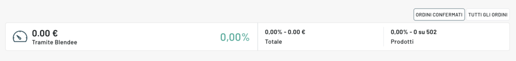
Orders: it will be possible to “switch” between confirmed orders or all orders
Users
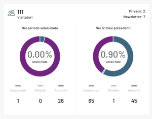
Visitors: number of visitors in the selected period and in the previous 12 months, divided into known, disclosed and anonymous
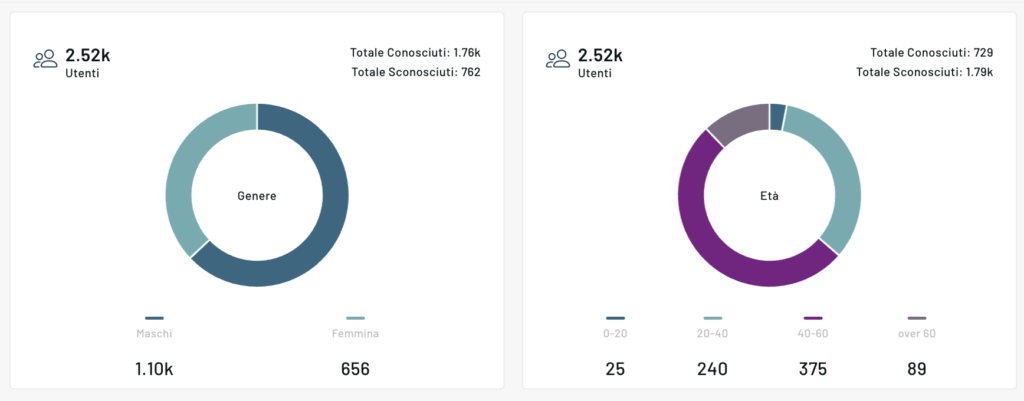
Users divided by gender and age
Active users: segments in order from most active to least active, the complete list is visible in detail accessible from the three dots at the top right.

RFM: User Scoring. Find out how many users in % have a certain score

Canals

Newsletters: data regarding how much turnover newsletters bring in %
Forms: leads brought by the active forms on the site and the number of views
Website: active web customizations that converted the most with the number of views and clicks collected.
Contents

Most viewed items: most viewed items and the corresponding turnover
Best-selling products: best-selling products and the corresponding turnover
Coupon purchases: most used coupons and the corresponding turnover
N.B.: In the case of a content catalog and not a product catalog, we will talk about statistics related to items instead of products and only the Overview, Users and Channels menus will be present.
Thanks for contributing!