After the brief introduction on the Blendee Dashboard (see “Introduction to the Dashboard”), in this article we will see the possibilities that the user has to customize the data visualization, according to their needs.
There are two types of customizations that can be made: temporal and visual.
Time Customizations
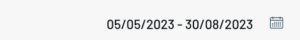
In order to carry out in-depth analyses, Blendee provides a period selector.
This gives you the opportunity to compare your data with extreme precision, let’s see how:
- Click on the top right of the Analytics section of the Dashboard to select the period you want to analyze
- The screen with the fields of the two periods to be compared will be shown in the foreground

Visual Customizations
To allow the user to highlight certain information over others, Blendee gives the possibility to choose which graphs to display first and which to remove from the view, simply by dragging the blocks to the desired position.

Was this content useful?
Thanks for contributing!