We’re going to explain how every single key in this template works.
For the initial configuration of the behavioural message, please refer to the dedicated article how to configure a behavioural message.
Throughout the article, when the On Exit event is referred to, it will mean when the user has passed the viewport of the website with the mouse.
OPTIONS > More
Cookie Duration (in days): We can indicate the time in which the message will not be shown to the user again after the user has closed it.
Timeout : Indicates how long the message remains in seconds.
Interval between displays (milliseconds): Indicates the delay time for the message to be displayed.
Sensitivity, the higher its value, the more easily the On Exit event will be triggered.
Only after x seconds can we enter a time in which the message will not be shown even if the On Exit event has occurred.
LAYOUT > Location & Size
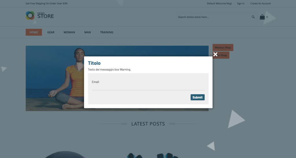
Rounded corners (in px) to set the rounded corners of the message.
Content padding (in px): The distance of the content from the edges of the message.
Top Position Close Icon (in px) indicates the distance between the top edge and the close icon (can have negative values).
Right Position Close Icon (in px) indicates the distance between the side edge and the close icon (can have negative values).
Background color to set the background color of the entire message.
Border width (in px): The outer border thickness of the message.
Outer border color: Outer border color of the message.
Close Icon Color to set the close icon color of the message.
Close box icon : Set the icon for the close message button.
Drop Shadow Color sets the color of the drop shadow.
Live Background Shape Opacity (in %) sets the intensity of animated outer shapes from 0 to 100.
Live Background Shape Color sets the color of animated outer shapes.
Outer Overlay Opacity (in %) sets the transparency of the outer overlay, accepted values from 0 to 100.
Outer Overlay Color sets the background color of the outer overlay.
Show Drop Shadow : We can turn the drop shadow on or off.
Animated outer overlay: we can decide whether or not to show animated shapes.
To show the outer overlay we can turn on or off all the outer overlay, if I turn it off the animated shapes will also not be visible.
Box position a select appears where we can set the position of our message.
Distance of the box from the sides (in px): set a minimum distance from the edges that the message must respect.
We can insert a CSS shape, we refer you to the site, to be able to generate your custom shapes.
Maximum box width (in px): We can set a maximum width of the message.
LAYOUT > Message Text
Side Image Width (in px): We set the maximum width of the side image.
Side image on the left if we choose if the image goes to the left, otherwise it is positioned on the right.
Display side image : we can decide whether to show or hide the side image.
Side image : we select the image through the media gallery.
Text content : We enter the text content you want to display.
Title Color : We can set a color for all the titles inserted in the previous text.
Text color : We set the color for the text (excluding titles).
Title Size (in px) – Text Size (in px)
LAYOUT > Content recommendation
These keys are only present in the “NEXT ON EXIT RECOMMENDATIONS” template.
Border Color between REC and Content : We set the color of the separator line between the text content and the carousel.
REC Image Height (in px): We set the height of the images inside the carousel cards.
Show REC before content if set to “yes” shows the carousel with recommendations first and then the content, otherwise it inserts it after.
Show REC : We can decide whether to show or hide the carousel with recommendations.
Border Thickness between REC and Content (in px): We set the thickness of the separator line between the content and the carousel.
REC button text : we enter the text that we want to be inserted into the button of each individual card.
REC Title : we enter the title that appears before the carousel (color and size takes those already set).
Hide REC Button: We can hide the button on each individual card.
Hide img REC we can hide the image on the cards.
Hide REC Prices : We can hide prices on cards.
Hide REC Description: We can hide the short description on the cards.
Hide REC Name : We can hide the name on the cards.
Hide REC Title : You can hide the title before the carousel.
REC Price Order | REC Image Order | Order description REC | Order Name REC We can decide the order of each item the higher the value and the sooner it will be entered.
Colour description REC | REC Name Color : We can set the color for the name and description inside the cards.
LAYOUT > More
Z-Index We set up a Z-index to place the message above our website.
Additional CSS code : we can insert custom CSS code WARNING: insert valid CSS code.
FORM > Location and Dimensions
To show form background, we can activate or deactivate the background of the form (if deactivated, the padding will be 0).
Padding form (in px if background is active) If the background is active, we can set a margin between the border of the form and the contents.
Rounded corners of the form (in px): if the background of the form is active, we can also set the rounded corners.
Form background color : Set the background color of the form.
Link color : we set the colors of the links within the form labels.
Form label color: The color of the text on the form labels.
Checkbox/radio form color: we set the color with which we highlight selected checkboxes and radios.
The color of the form input border color of the outside border of the form inputs.
Form Input Background Color: The background color of the form inputs.
Hide Form: We can hide or show the form.
BUTTONS > Button (valid for all buttons)
Text color: Buttons : The color of the text for the buttons.
Text color: Button rollover : The color of the text when the mouse is hovered over.
Button Background: The background color of the buttons.
Buttons background rollover background color on hover.
Button text size (in px)
Rounded corners: buttons (in px): Rounded corners of buttons.
Button border color: rollover button color: hover border color.
Border color: Buttons , border color.
Button border size button border thickness (in px).
Thanks for contributing!

