N.B.: There is a new version available for this template, it’s called “Next on Exit”, which you can find the guide for here.
Thanks to the pop-up on exit, you can intervene before the user leaves the site. It appears when the user is about to exit the navigation window.
Let’s move on to the practical part, which is how to configure a pop-up on exit.
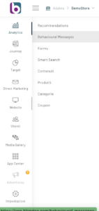
From the left menu, go to Website -> Behavioral Messages.
From the control panel, click on the “New Behavioral Message” button at the top right.
This will take you to the configuration window (to learn more about the steps, read the following article “How to configure a behavioural message”), from which you can continue with the settings until you choose the Template .
You can check the progress of the configuration through the wizard bar at the top of the page.
At this point you can click on the “Select” button corresponding to the On Exit Message template and continue with the Customization by clicking on the “Next” button at the bottom right of the page.

Before creating the layout of the recommendation, it is necessary to enter the complete URL of the site in the appropriate bar to view the preview and click on the arrow
 icon.
icon.

If the URL entered is correct, the site will be loaded in preview. At this point it will be necessary to select where to insert our REC by clicking on the select element icon  . You will be given the option to choose between automatic selection and manual configuration.

With the automatic selection we could move around the screen and we will see the element on which we position ourselves highlighted with an orange border. By clicking on it, we will select the element and a further configuration will appear relating to the choice of the position of the REC with respect to the selected element.

The choices are:
- Before the item
- After the
- In place of the element
Once you have set the position of the Message, you will be able to use the editor that will appear in the left column.

In the left column, by clicking on the respective buttons, you can:
- Enter the text of the message: a small additional editor will open
- Enter the title of the message: a small additional editor will open
- Insert the border and background of the box:
- Edge thickness
- Edge Rounding
- Border color
- Background color
- Determine the location and size of the box
- Message size (small-medium-large)
- Display Wait (seconds)
- Distance from top margin (px)
- Placement level (Z-Index)
- Wait for display once closed (days-hours-minutes)
- other
- Display on Load (or not)
- Scroll Offset
- seconds of visibility
- Close the other warnings (or not)
- Layout
- Message Location
- rounded corners
- Content padding
- Close Icon Position
- Background color
- Border width
- Closure Icon Color
- Show Drop Shadow
- Animated Overlay
- Box Position
- Maximum box width
- Message Texts and Images
- Side Image Width
- Side Image Position
- Side image
- Text content
- Title Color
- Text color
- Title size
- Text size
- Close the other warnings (or not)
- Additional CSS code
- Message Location
- Form
- Show forms (or not)
- Link Color
- General Padding Form
- Input Color
- Checkbox color
- Input Border Color
- Rounded corners
- Buttons
- Button Text Color
- Button Background Color
- Button Text Size
- Rounded corners
- Border color
- Border size
Click on “Update Preview” to get a preview of the recommendation. From the device icon  You can choose whether to preview the mobile, desktop, or tablet format.
To check the result, click on “update preview” at the bottom of the left column.
Thanks for contributing!