We’re going to explain how every single key in this template works.
For the initial configuration of the behavioural message, please refer to the dedicated article how to configure a behavioural message.
LAYOUT > More
Activate button panel edge animation We can decide whether or not to animate the edges of the central opening button.
Enable padding for the site body if set to yes, the height of the message is set as padding on the body and then all the contents of the page will be displayed when the bar is closed, if set to no the message overlaps the site elements.
Top panel : If set to yes, the panel will be visible at the top of the viewport, otherwise, it will be displayed at the bottom.
Z_index set up a z-index to place the message above our website.
Show custom form : If set to “no” the form will not be displayed.
Drop Shadow : Toggle the display of the drop shadow to the box.
Additional CSS code : we can insert custom CSS code WARNING: insert valid CSS code.
LAYOUT > Button
Left panel button (put no to the middle position first) If the middle button option is on “no”, we can put the open button on the left or right.
Center Panel Button : The position of the open button is forced centrally when set to “yes”.
Button panel border size (in px) | Rounded corners button panel (in px) | Button panel size (in px) we configure the size of the opening button, if size and rounded corners have equal values, the button will be round.
Rollover Button Panel Border Color | Button panel border color | Rollover Button Panel Background Color | Rollover button panel icon color | Button panel icon color | Background button panel we set the colors for the open button, also for the hover state.
Button panel icon size (in px) | Button panel icon , size and type of open button icon.
LAYOUT > Location & Size
Content padding (in px) | Rounded corners content (in px) | Border color content | Content Border Size (in px) | Exterior Overlay Color | Content Background Color : We set colors and padding for inner content and outer overlay.
Image width (in px): we set the size of the additional side image.
Drop Shadow Color | Outer Edge Dimension (in px) | Outer Edge Color : We customize outer board, color and size.
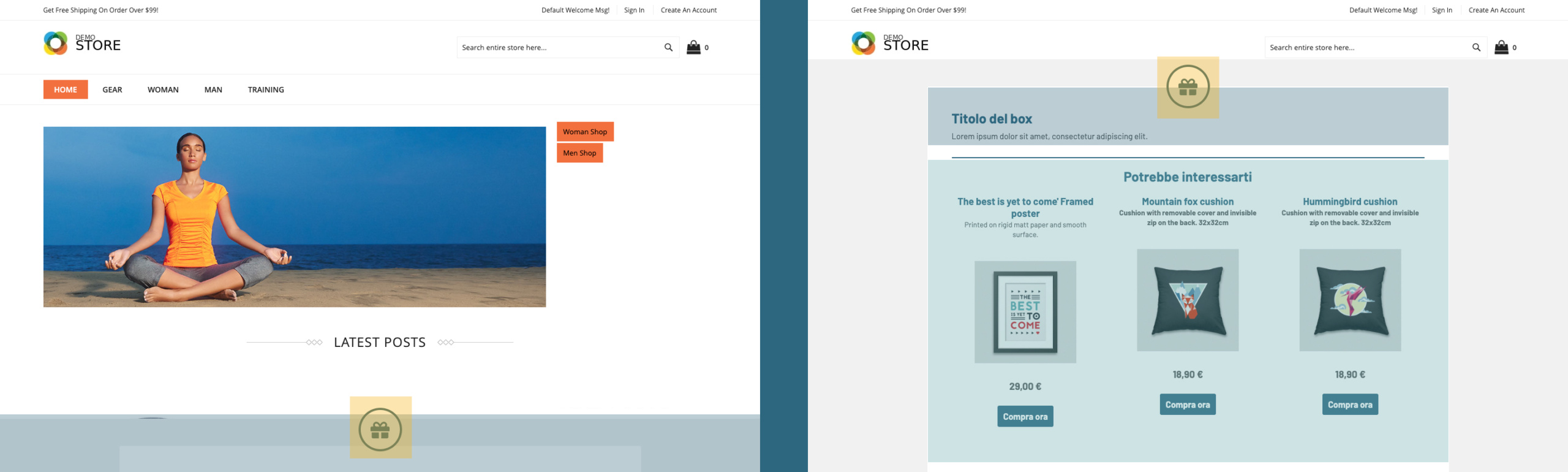
LAYOUT > Recommendation content
Show REC : If set to “no” the rec will not be visible.
REC Title Text is the text that appears before the rec.
REC Button Text : We set the text for the individual card button.
Border Thickness between REC and Content (in px) is the size of the dividing line between text content and rec.
REC image height (in px): the size of the images inside the cards.
Border color between REC and Content : We set the color of the separator line between content and rec.
REC Price Size (in px) | REC Name Size (in px): We set the text size for the cards.
Hide REC Title | Hide REC Name | Hide REC Description | Hide img REC | Hide REC Pricing | Hide REC button : we set the contents that we want to display inside the cards.
REC Price Order | REC Image Order | Colour description REC | Order description REC | Order Product Name REC | Product Name Color REC We configure the order and colors of the contents for the individual cards.
LAYOUT > Message Text
Title size (in px) | Uppercase Titles | Title Color: Set the style for the content titles.
Text content : We enter the text content you want to display.
Side image : we select the image through the media gallery.
Side image on the left if set to yes, the image will be displayed on the left, otherwise it will go to the right.
Visible side image : We can decide whether or not to show the image next to the text content.
Text Color | Link Color | Text size (in px): We customize the colors and size of the additional text.
Hide text : we can hide the whole box with additional text.
BUTTONS > Button
Button Rounded Corners (in px) | Button text size (in px) | Pulsed Text Color | Rollover Pulsed Text Color | Button Background | Rollover Buttons Background | Uppercase Button Text | Rollover Button Border Color | Button Border Color | Button border size (in px) Customizations for the REC and Form buttons.
FORM > Button
Form Input Background Color | Form Input Border Color | Color checkbox/radio form | Label form color | Form Background Color : We customize the colors of the form.
Round Corners Form (in px) | Padding forms (in px if background is active): These elements will only be active if the background of the form is displayed.
We can decide whether or not to display the background of the form.
Form before the REC : We can insert the form before or after the text content.
Thanks for contributing!