We’re going to explain how every single key in this template works.
For the initial configuration of the behavioural message, please refer to the dedicated article how to configure a behavioural message.
This simple message is designed to display a small pop-up notification on the page about a piece of information, an error or a successful action.


The configurable characteristics are the same for each message group:
- Error Notification
- Success Notification
- Notification Info
- Warning Notification
Error/Success/Info/Warning Notification
Within each group we have the More and Message Text menu
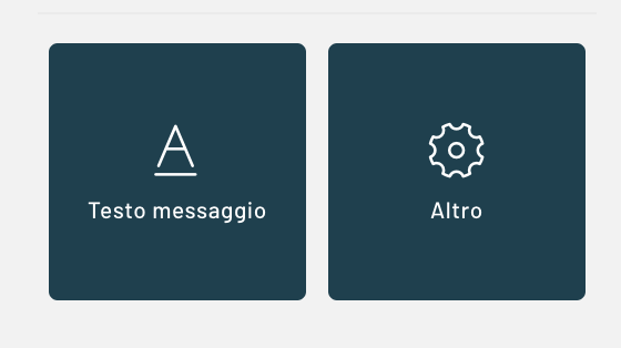
Notification -> Message Text
Notification Subtitle: text that will appear as a subtitle in the box, below the title
Notification Title: Text that will appear as the title of the notification
Notification Color: Color of the background of the notification box
Font size Notification Text: The size of the font used for the notification text
Notification Text Color: The color used for the notification text
Notification -> More
Show Notification: shows/hides the corresponding notification
Rounded corners Notification : Rounding radius of the edge of the message box
Notification icon: you can choose an icon to show inside the box
Notification Icon Color: Color set for the notification icon selected in the previous step
Other
Other->Properties
Disappear timer (in sec): you can set how many seconds the message will remain visible
Layout
Layout->Other
Icon size (in px): size of the notifications inside the message
General Timer Notifications:
Additional CSS code: in this box you can further customize the stylesheet by inserting an additional valid CSS code
Layout->Positions and Dimensions
Notification Position: You can choose the positioning of the notification box from the following possibilities: center, top center, bottom center, top right, top left, bottom right, bottom left, center left
Thanks for contributing!