We’re going to explain how every single key in this template works.
For the initial configuration of Recommendations, please refer to the dedicated article how to create a recommendation.
The template activates an animation of the page that resizes its content and arranges it in one of the four corners of the window and, in the space obtained, shows the recommendations produced if set. It is inspired by the television advertising layout called picture-in-picture.
There are two versions of this template available for behavioral messages, both with the option to insert recommendations inside and without, which only shows a background image.


Layout -> Recommendation Content
REC Button Edge Radius: Rounding radius of the button containing the card link
REC Button Text Color: The color of the text inside the button containing the card link
REC content padding (px): The space between the contents of the rec and the box that contains it in pixels.
REC button padding: space between the content of the button and the box that contains it in pixels.
REC Button Text: Text contained in the body of the button
Left/Right Card REC margin: Outer space from the container in pixels, from the left and right.
Top/Bottom Card REC Margin: Outer space from the container in pixels, top, and bottom.
Padding Left/Right Card REC: space between the content and the box that contains the recommendation in pixels, from left to right.
Padding Top/Bottom Card REC: space between the content and the box that contains the recommendation in pixels, from the top and bottom.
Card border size: size of the card border bounding line
REC Card Width (%): Percentage width of the card containing the product
Price padding (REC in row): distance between the price and its container, in the case of recommendations arranged in a row (if selected Yes on Position and dimensions – REC row (yes) _ REC column (no))
REC Container Background Color: The background color of the card containing the recommendation.
Original Price Bar Color: Price Cut Bar Color
Original price bar size (in px): thickness of the price cut bar
Sale Price Color: Color of the price net of discounts
Hide image discount label: show or hide the “discount” label above the card
Original Price Slanted Bar: You can tilt the price cut bar or leave it horizontal
Sale price size (in px): Font size used for the price minus discounts
Hover Card Background Color: Hover card background color
Hover Card Border Color: Hover card border line color
REC hover button background color: Background color of the product button on hover
Card Text Size: Font size used in product cards
Image size in REC (px): Size in pixels of product images
REC Card Background Color: The background color of the product card
REC Button Background Color: The background color of the product button
REC Button Top Margin: Space from the top of the button container, in pixels
REC Promo Price Top Margin: Space from the top of the sale price container, in pixels
Top Margin Starting Price REC: Space from the top of the original price container, in pixels
REC Promo Price Color: Color of the product’s discounted price
REC Starting Price Color: The color of the product’s starting price
REC Product Description Color: Font color of the product description
Top margin REC description: space from the top of the product description container
REC hover button lettering color: hover button text font color
Layout -> Location & Size
Row REC (yes) _ Column REC (no): if selected YES The products appear arranged by row, the position of which can be chosen from up and down from the field REC Position: High (Yes), Low (No); Otherwise, if you select NO The products are shown in a column that can be on the right or left of the screen, this position can be chosen by acting on the field below.
REC position: right(yes), left(off): if YES is selected, the products are displayed on the right side of the screen; If NO is selected , the products are displayed on the left side of the screen. All this only if we have chosen the column view in the home box.
REC position: high (yes), low (no): If YES is selected, the products are shown at the top, otherwise with NO they are displayed at the bottom. This option only works if we have selected the in-row view in the first box.
Background image: by default, a color is shown in the background that can be set in the following point; If you want to display a background image here, you can upload it
Background color: The background color below the resized page container and the recommendation row or column
Layout -> Button
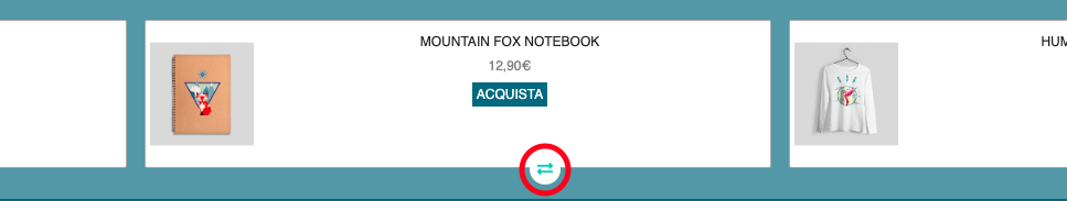
SWIPE icon background color: background color of the icon used to scroll left and right through recommendations, active only in the case of in-line display.
Hide SWIPE icon: Hide/show swipe icon visible in the image above, highlighted in red. This icon is only available for displaying in-line recommendations.
Close button icon color: The color of the close button icon
Close Button Rollover Color: Hover color of the Close button icon
Close button background rollover color: The color of the button background to close hover recommendations.
Square Latch Button Shape (YES: Square _ NO:Circle): Square or Round Latch Button Shape
Close button icon: Close button icon, default X
Close button size (in px): The size of the font used for the close button icon
Close button background color: The background color of the Close button
REC card border color: color of the line that delimits the cards containing the recommendations
SWIPE Icon Color: The font color used for the Swipe icon
Layout -> More
Timer: In this field, you can set how long it takes for the animation to be activated after uploading.
Layout -> Embedded Content
Add Custom CSS: A text field where you can insert your custom stylesheet.
Thanks for contributing!