We’re going to explain how every single key in this template works.
For the initial configuration of the Behavioural Message, please refer to the dedicated article how to configure a behavioural message.

OPTIONS > More
Show message on upload immediately visible on upload.
Show after scrolling (in px) indicates how many px we need to scroll from the top of the page to see the message.
Idle time since close shows how long I don’t have to show the message again if it is closed.
Only after x seconds do we set a delay in the display.
Initial animation (fadein/fadeout): we can decide whether to apply an effect to the opening and closing of the message.
Warning duration (in seconds): we can set a maximum time for which the message will remain visible (only if the Warning key visible until closed set to no).
Warning visible until closed : we can make sure that the message remains visible until the user closes it.
LAYOUT > Content recommendation
(only present in the “Next Warning Carousel” template)
Show REC : we can decide whether or not to hide the carousel with recommendations
Show REC before content if set to “yes” the carousel is inserted before the content, otherwise it is inserted after.
REC Title : We can enter the title text that appears before the carousel.
LAYOUT > Message Text
Text size (in px) | Title size (in px) | Text Color | Title Color : We can set color and size for titles and text.
Text content : small visual editor from which we can enter the text to be displayed in the message.
Side image we can insert a side image through the Blendee media gallery.
Display side image we can decide whether to display the side image or not.
Side image on the left : if set to “yes” the image will be inserted on the left, otherwise it will go to the right.
Side image width (in px): we can set the maximum width of the side image.
Link color : We can set a color for links within the text content.
Additional Button Target : We set the target (where the link opens) of the additional button.
Additional button text : we can insert the internal text of the button (colors and more are taken from those we set in the other keys).
Additional button link : enter the URL to which the button should link.
Hide additional button : we can decide whether to hide the additional button.
Video Iframe: in the case of a warning with video, we can insert the iframe of the video to be displayed.
LAYOUT > More
Maximum box width (in px): We can set a maximum width of the message.
We can insert a CSS shape, we refer you to the site, to be able to generate your custom shapes.
We can decide whether or not to show the outer overlay.
Animated outer overlay: We can decide whether to display animated shapes.
Outer Overlay Opacity (in %) accepts values from 1 to 100 and sets the opacity of the outer overlay.
Live Background Shape Opacity (in %) sets the opacity of animated outer shapes.
Closing box icon : we can select the icon to be used for the close button of the message.
zindex We set the z-index to place the message on top of the site elements.
LAYOUT > Position & Size
Distance of the box from the sides (in px): set a minimum distance from the edges that the message must respect.
Box position a select appears where we can set the position of our message.
Show Drop Shadow : We can turn the drop shadow on or off.
Outer Overlay Color sets the background color of the outer overlay.
Live Background Shape Color sets the color of animated outer shapes.
Show Drop Shadow : We can turn the drop shadow on or off.
Close Icon Color to set the close icon color of the message.
Outer border color: Outer border color of the message.
Border width (in px): The outer border thickness of the message.
Background color to set the background color of the entire message.
Right position closing icon (in px) | Top position closing icon (in px) we can place the closing icon, we can also enter negative values.
Content padding (in px): The distance of the content from the edges of the message.
Rounded corners (in px) to set the rounded corners of the message.
FORMS & BUTTONS > Button
Button Border Size | Button border color : The color and thickness of the button border.
Rollover Button Border Color sets the color of the borders on hover.
Rounded corners of buttons (in px): The distance between the content and the edge of the button.
Button text size (in px)
Buttons background rollover background color on hover.
Button Background: The background color of the buttons.
Text color: Buttoned rollover text color on hover.
Text Color Buttons: Text Color Buttons.
FORMS AND BUTTONS > position and size
(not present in the template with video)
Hide form: we can decide whether or not to hide the form.
Form Input Background Color sets the color of the form’s inputs.
Form Input Border Color sets the border color for form inputs.
Checkbox/radio form color sets the color with which we highlight selected checkboxes and radios.
Form label color: The color of the text on the form labels.
Form background color : Set the background color of the form.
Rounded corners of the form (in px): if the background of the form is active, we can also set the rounded corners.
Padding form (in px if background is active) If the background is active, we can set a margin between the border of the form and the contents.
To show form background, we can activate or deactivate the background of the form (if deactivated, the padding will be 0).
Keys present only in the “Next Warning Carousel” template
CAROUSEL > Location & Size

Active Carousel Bullet Background Color | Active Bullet Carousel Border Color | Color Bullet Carousel Border | Bullet carousel rollover background color | Bullet Border Color: Carousel Rollover : Customize the colors of the bullets used for carousel pagination.
Margin before and after the carousel (in px) We set a margin before and after the carousel.
Central carousel controls puts buttons and bullets all central.
Carousel controls grouped to the left (only if centered set to off) puts all controls grouped to the left.
Carousel padding between elements (in px) distance between one card and another.
Right arrow carousel icon for left arrow.
Left arrow carousel icon for right arrow.
Bullet carousel background color : We customize the colors of the bullets used for the layout of the carousel.
Horizontal padding: Carousel controls (in px): Lateral distance between the icon and the edge of the “left” and “right” arrows.
Carousel controls icon size (in px): left and right arrow icon size.
Vertical padding: carousel controls (in px): distance between the icon and the top and bottom edges of the left and right arrows.
Border thickness of carousel controls (in px): Thickness of the border of left and right arrow buttons.
Rounded corners, carousel controls (in px), rounded corners, left and right arrow buttons.
Carousel Controls on the Sides inserts arrows on either side of the carousel, one on the left and one on the right, centered vertically to the content.
Bullet carousel size (in px): We set the size of the pagination bullets.
Card bottom edge size (in px) | Top card edge size (in px) | Card Roll Border Color | Card Rollover Background Color | Card Border Color | Card Background Color | Vertical card padding (in px) | Horizontal card padding (in px) | Left side card border size (in px) | Size of the left side edge of the card (in px): customizations of the individual cards.
CAROUSEL > More
Activate drag mouse carousel We can activate or deactivate the drag of the carousel with the mouse.
Hide carousel nav hides pagination bullets.
Hide Carousel Controls hides the right-left arrows.
Carousel autoplay sets the carousel autoplay.
Carousel autoplay pause rollover if set to “yes”, when the mouse stops in the carousel area, it no longer scrolls automatically.
Carousel animation timeout sets the animation time for autoplay.
Card Image Animation toggles the image zoom on or off when the mouse hovers over the card.
CAROUSEL > Content recommendation
Order Product Name | Brand Order | Image Order | Order short description | Order price we can decide the order of each item the higher the value and the sooner it will be entered.
Show currency symbol before price if set to “yes” shows the currency before the price, otherwise it inserts it after.
Brand name size (in px) | Brand Name Color | Color Reduced Price | Original price | Product description color | Product Name Color | Product description size (in px) | Product Name Size (in px) | Maximum carousel image height (in px) | Bar size original price (in px) | Bar Color Original Price | Size sale price (in px) | Original price size (in px) we set the colors and size of the text content of the cards.
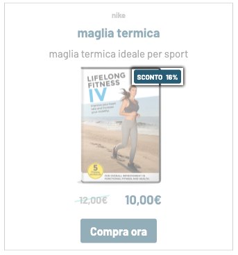
Hide Additional Text Discount Label | Discount Label on the Left | Discount Label at the top | Rounded Corners Discount Label | Discount label text size (in px) | Discount Color Label | Vertical Distance Discount Label (in px) | Horizontal Distance Discount Label (in px) | Discount label internal padding (in px) | Additional Text Discount Label | Discount label background : these parameters are used to customize the discount label.
Hide Image Discount Label | Hide REC Button | Hide REC Pricing | Hide REC Image | Hide REC Description | Hide REC Name | Hide REC brand: we can hide the elements of the card that we want.
Original Price Slanted Bar : If set to “Yes”, the bar on the sale price will be oblique, otherwise it will be straight.
CAROUSEL > Button
Full-width button sets the card button across the width of the card.
Button Text : Enter the text for the card buttons.
Padding above/below button (in px) sets the top/bottom margin between the content and the edge of the button.
Button side padding (in px) sets the left/right margin between the content and the edge of the button.
Thanks for contributing!