To create the template of our form we use the editor that we can see in the photo, accessible from WebSite -> Forms, in edit mode or when creating a new form.

In the left column we find all the fields that we could insert in our form and on the right the page where we can build our template.
Structuring the form will be simple. We should click on the type of field we would like to use from the list and drag it onto the blank sheet. It will be possible to drag and drop more elements to compose our layout.
To change its order, you will need to click on a single element and drag it above or below the others.
In addition, by going over each field with the cursor, the icons necessary for managing it will appear at the top right: Delete, Edit and Duplicate.
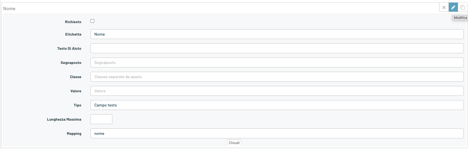
Upon modification it will be possible to fill in the specific details of each field, which will change according to the type.
Below is the list of editor fields and what they correspond to.
TEXTS
The first items that appear in the left side menu are:
- Telephone with area code
- Email Address
- Name
- Surname
- Zip code
- Address
- City
- Province
- Region
- State
- Cellular
- Telephone
- Sex
- Date of birth
- Fidelity Card
- Company Name
- Category: Company
- Receive Newsletter
- Receive Commercials
COMMON FIELDS
Opening the settings for each field we find some information common to all types, let’s see them below.
Required: A field to check if the element in question is critical to the form. This will prevent you from continuing if the item is not completed.
Label: Field name
Help Text: You can enter a text that will be displayed in the speech bubble that appears by clicking on the Help(?) icon.
Placeholder: Placeholder displayed in the input field
Class: To be inserted for changes to CSS.
Value: The value passed with this field
Mapping: a unique term for each element, which we will then use as a filter.
To close the details part of each item, click on the word “Close” at the bottom center of the tab.
CUSTOM FIELDS
In the second section there are all the custom fields that the user creates in the dedicated section
Custom fields are very useful, and allow you to customize a form to the maximum, with fields that can be reused in any form. They are defined at the user level.

TOOLS
Finally, the last section of available button types, in the Tools section
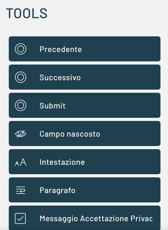
In this section we find the three types of buttons, already configured for a specific action of the form.
Previous is used to go back one page on the step form.
Next is used to move forward one page on the step form.
Submit is used to submit the form.
The Hidden Field element allows you to pass “service” parameters, without making their presence felt by the user. The Name detail cannot be empty and will name the input.*

The header is the element that allows you to insert a title or subtitle to our form. On Label we could enter the text and establish its Type by selecting from the options proposed:*
- H1
- H2
- H3
- H4
- H5
- H6

The Paragraph element will allow you to insert a textual content in the appropriate area and select the type among the following:*
- p (paragraph)
- address
- BlockQuote
- Canvas
- output

The privacy acceptance message will take care of showing the link to the privacy and a field to be flagged in order to proceed with the submission of the form and the acceptance of the data processing.
Thanks for contributing!